
Professional Colour Consultation for Your Home
Stop guessing at paint chips. Get expert guidance that aligns your colours with your lighting, furnishings, and the home you're building.
The Right Colour Elevates Everything. The Wrong One Costs You Twice.
Paint is one of the most transformative and cost-effective improvements you can make to a home. It's also one of the easiest to get wrong. When picking a colour, we borrow a principle from the carpenter's playbook: "measure thrice, cut once." A colour that looks perfect on a chip under the store's lighting can look entirely different on your walls under your home's lighting, under lighting during dusk or dawn hours, under natural sunlight or cloudy weather, and next to other finishes in your home (namely, your flooring, furniture, cabinetry, and so forth).
Our colour consultation service helps you get it right the first time. We bring the knowledge, the tools, and the trained eye to guide you to colours that work — and that you'll be genuinely happy with for years.
What's Included in a Colour Consultation
A professional consultation isn't just someone handing you a fan deck. It's a structured process designed to arrive at confident, coordinated colour decisions.
On-Site Lighting Assessment
We evaluate how natural and artificial light behaves in each room at different times of day. Light is the single biggest variable in how a paint colour reads — and it's the one most people ignore.
Existing Finishes & Furnishings Review
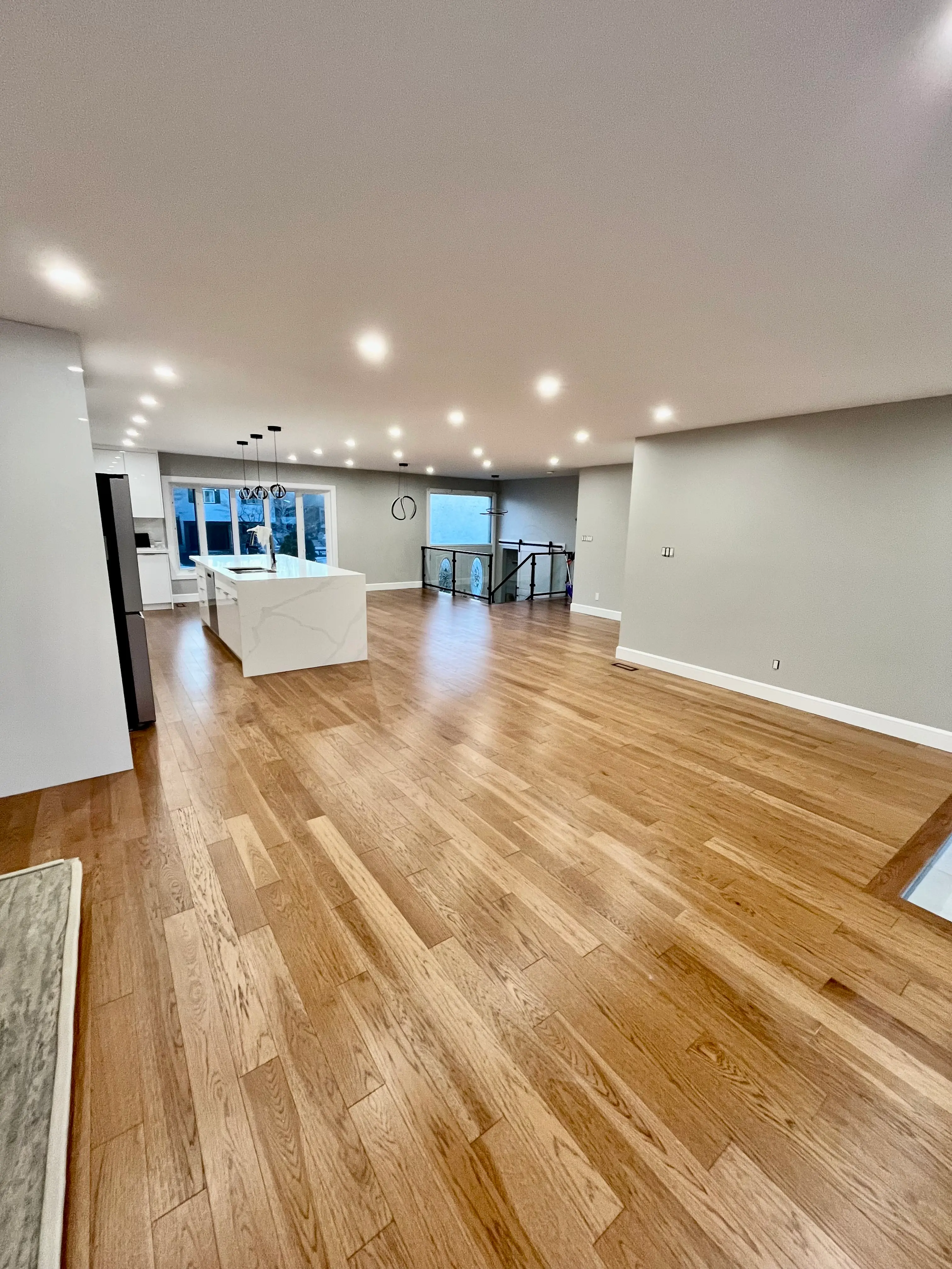
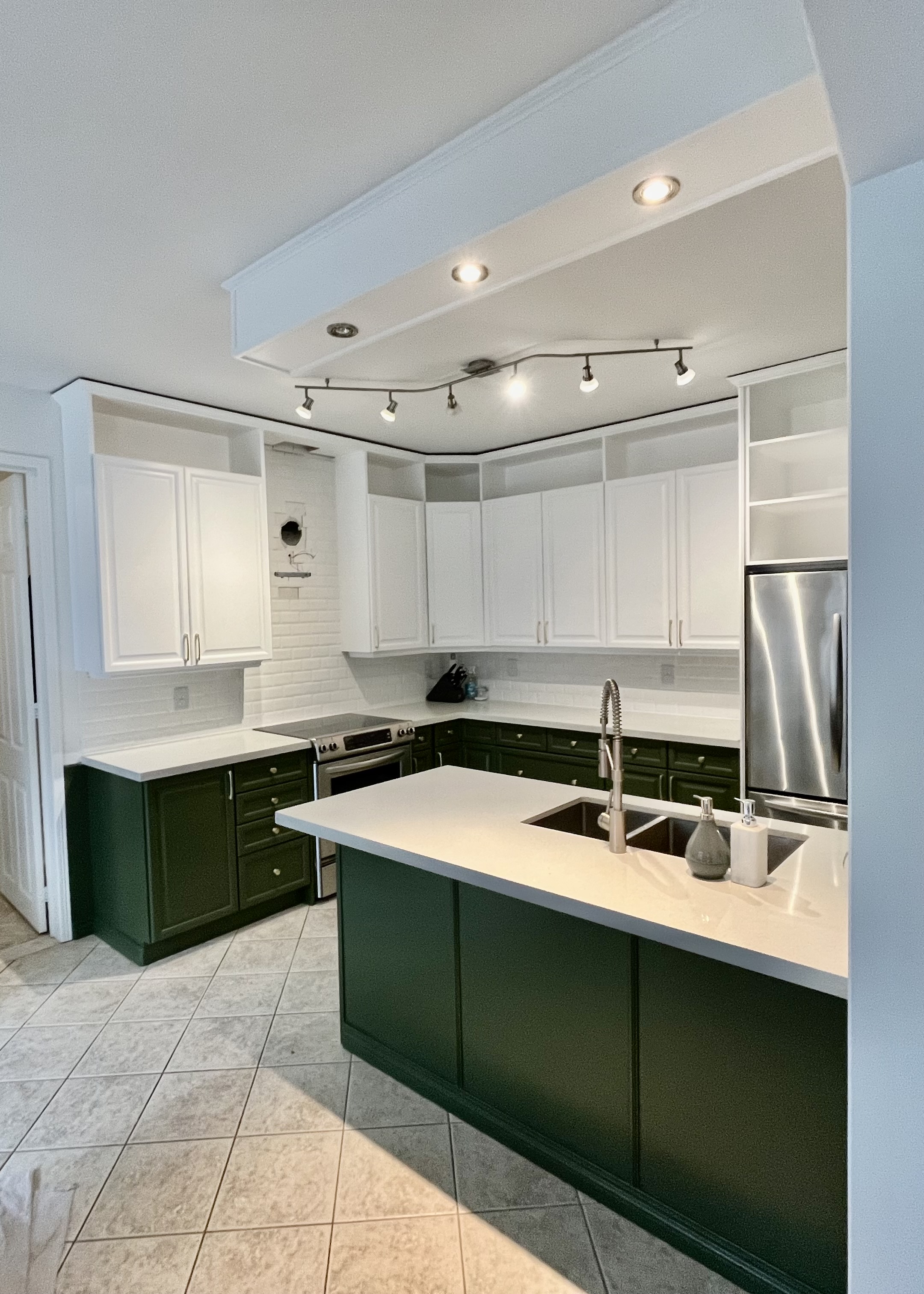
Your flooring, cabinetry, countertops, furniture, and fixed finishes all influence which colours will feel cohesive. We work with what you have, not in isolation from it.
Curated Colour Shortlist
We narrow thousands of options to a focused shortlist of 3-5 colours per space that are calibrated to your specific room conditions. We then get sample pots of the prospective colours and apply them around your home so you can see how they look in different lighting.
Whole-Home Colour Flow
We plan colour transitions from room to room so your home feels intentional and cohesive. Not a disconnected collection of individual decisions.
Exterior Colour Coordination
For exterior consultations, we consider your siding, trim, doors, roof, and hardscape to build a palette that works with your home's architecture and neighbourhood context.
Paint Product Guidance
We advise on the right sheen levels and paint lines for each surface. Not every finish is appropriate for every application. The right product extends your paint job's life significantly.
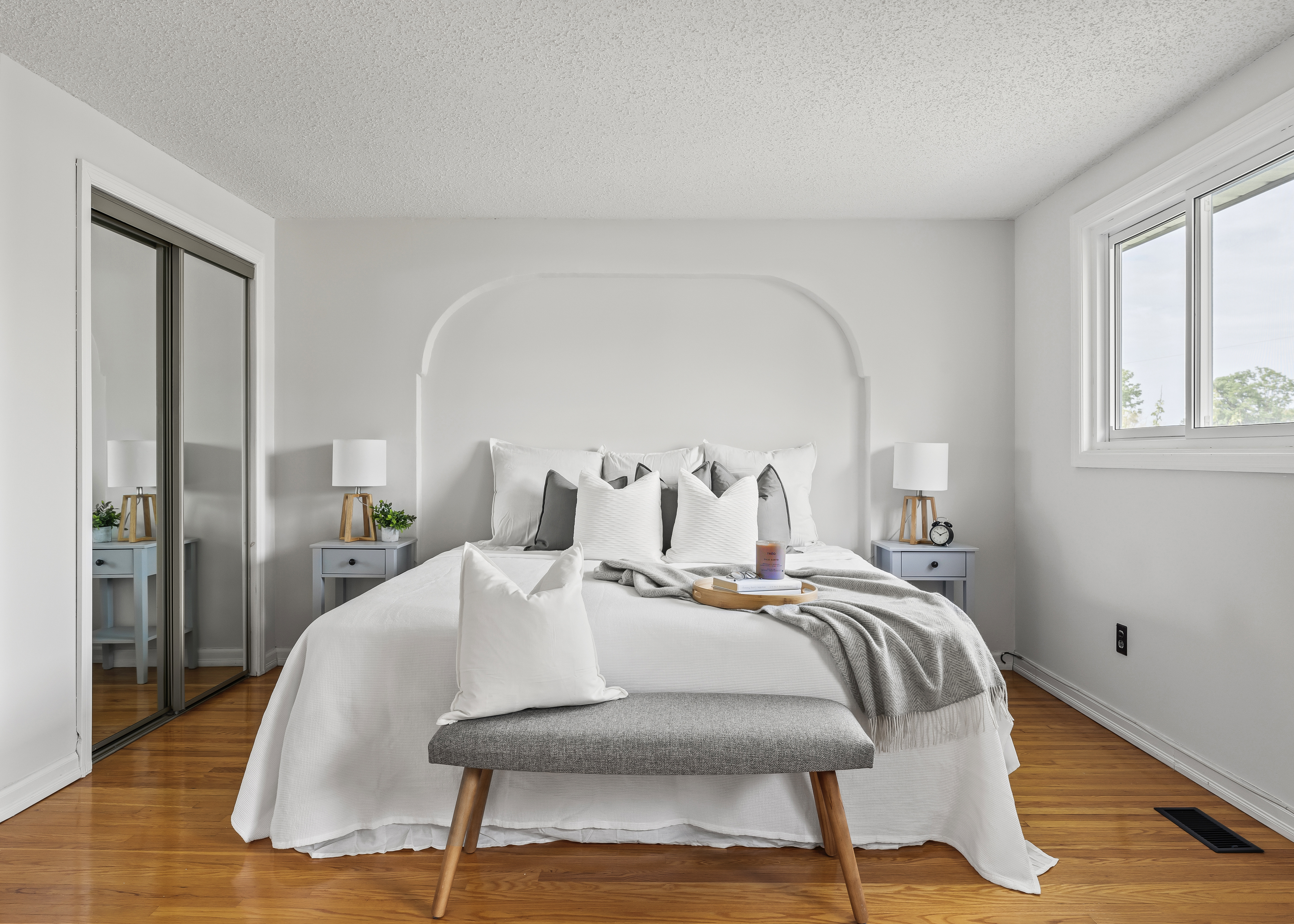
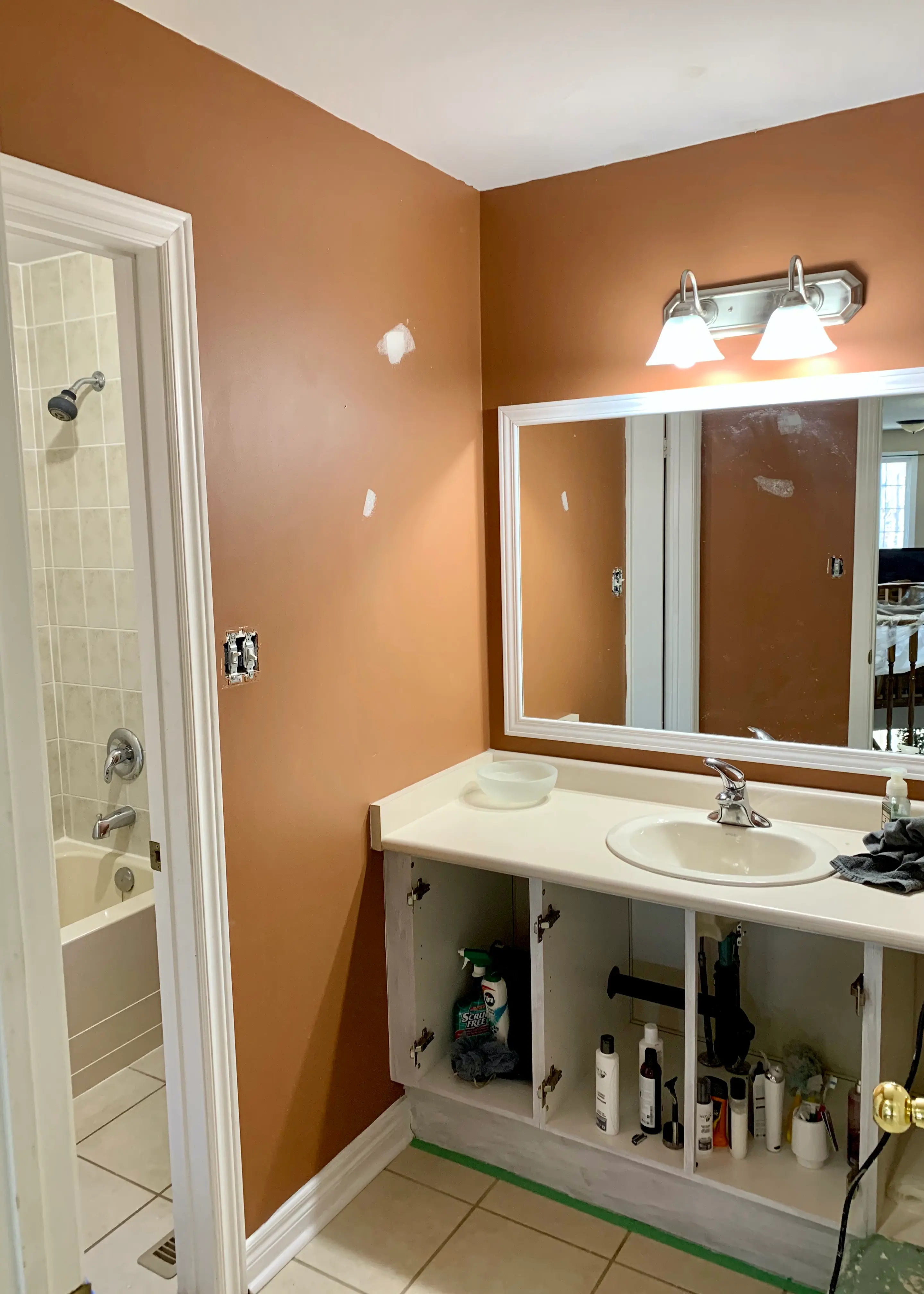
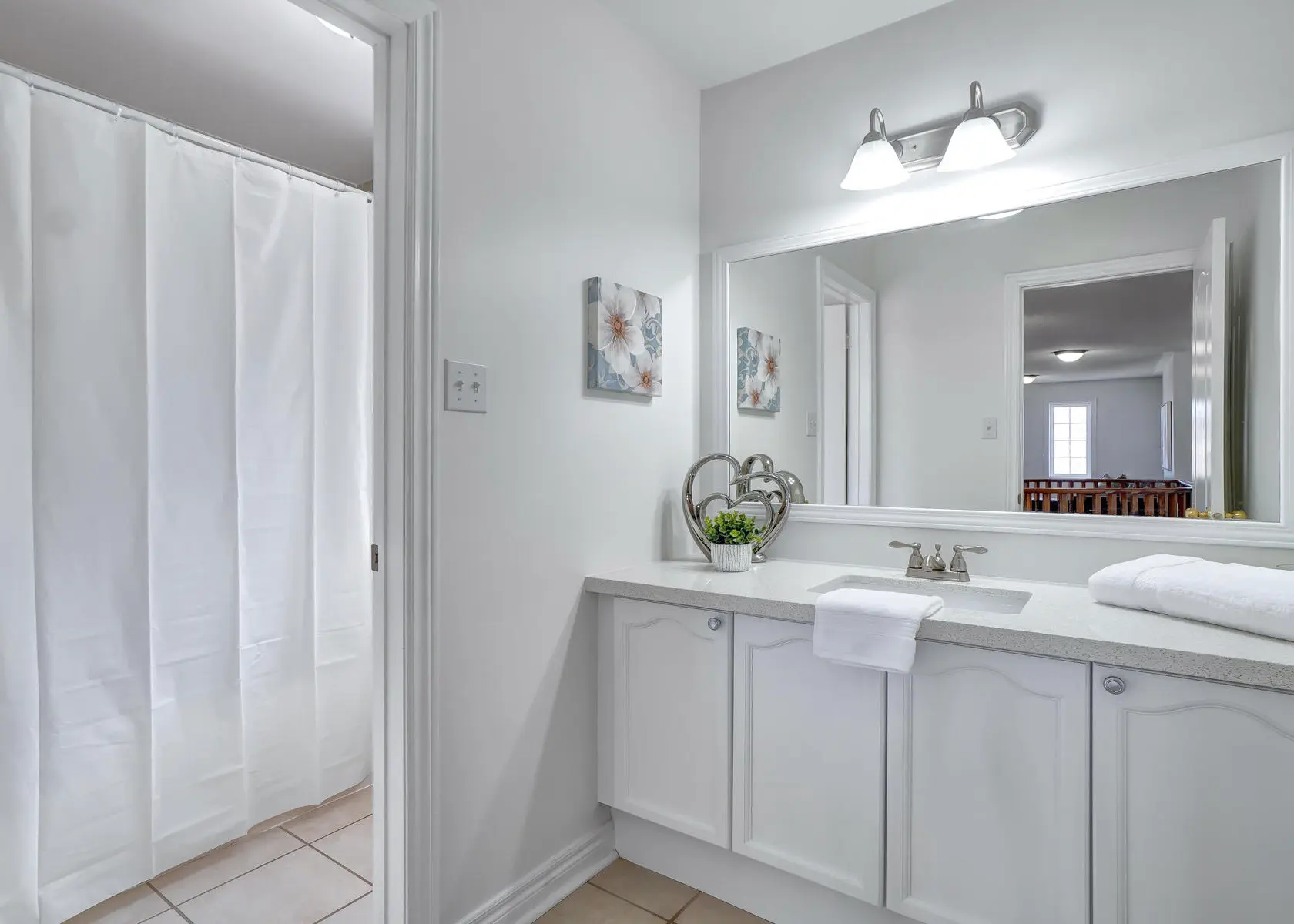
The Difference the Right Colour Makes
A bathroom with dated orange walls, refreshed with a soft neutral palette. The room is the same. Everything else changed.
Colour Advice From Someone Who Has Painted Hundreds of Homes
There's a difference between a colour consultant who works from theory and one who has personally applied paint in hundreds of Durham Region homes — and seen firsthand how colours behave on walls, in different light, at different seasons.
Michael's approach to colour guidance is rooted in practical experience. The advice isn't academic. It's grounded in what he's seen work and what he's seen disappoint homeowners who chose without guidance.
When your consultation leads to a painting project, that knowledge flows directly into how the work gets done.
"Seeing the paint colour on a small card or digital device is not the same as seeing it on the surface you want to paint. Always get the sample pots. Spot paint your final choices side-by-side in different areas of your home that have various lighting levels. Measure thrice and cut once."
— Michael Cappa, Founder, Altona PaintingColour Systems We Work With
What We Cover in Each Consultation Type
Interior and exterior colour decisions involve completely different variables. We structure each consultation accordingly.
Interior Consultation
- Natural & artificial light assessment per room
- Coordination with flooring & millwork
- Ceiling, trim & accent wall strategy
- Room-to-room colour flow planning
- Sheen selection by surface type
- Low-VOC & washable product guidance
- Feature & accent wall recommendations
Exterior Consultation
- Siding, trim & accent door palette
- Roof & hardscape coordination
- Neighbourhood & architectural context
- Fade & climate resistance considerations
- Curb appeal & resale value guidance
- Brick or stone undertone matching
- Product selection for Ontario climate
Our Consultation Process
A straightforward process designed to get you to confident colour decisions — efficiently.
Discovery Call
We discuss your project scope, your style instincts, colours you love and hate, and any fixed elements we need to work around.
On-Site Visit
We walk through your space, evaluate the light, assess existing finishes, and take notes on what we're working with.
Colour Shortlist
We present a curated shortlist per space. Not a fan deck dumped on the table. Each recommendation comes with reasoning.
Sample & Confirm
We guide you through the sample pot process. How to test, where to test, and how to evaluate the result before committing.
Five Things Most Homeowners Don't Know About Choosing Paint Colours
The undertone changes everything
Most "white" paints have undertones — pink, yellow, green, grey. These become visible next to your trim, cabinets, and flooring. A professional eye catches this before the paint is on the wall.
North-facing rooms need warm colours
Rooms that get no direct sunlight will make cool colours feel cold and flat. The same colour that feels airy in a south-facing room can feel dungeon-like facing north.
Sheen matters as much as colour
A flat vs. eggshell vs. semi-gloss finish changes how the colour reads completely. Which is right depends on the surface, the traffic, and the look you want.
Phone screens and sample cards lie
Screens render colour with backlighting. Sample chips are tiny. Neither shows you how a colour behaves at scale, on textured drywall, in your actual light. Sample pots are non-negotiable.
Dark colours aren't harder to live with than you think
Many homeowners avoid deep, rich colours out of fear. Only to later wish they'd been bolder. Done correctly, dark colours add drama, warmth, and perceived height to a room.
Frequently Asked Questions
Serving Durham Region & the GTA
Altona Painting provides colour consultation services across Ajax, Pickering, Whitby, Oshawa, Courtice, Bowmanville, Uxbridge, Port Perry, Newcastle, Newtonville, Peterborough, Cobourg, Port Hope, Etobicoke, Leslieville, Scarborough, Markham, Richmond Hill, Vaughan, and Whitchurch-Stouffville. Consultations are typically paired with a painting project. Book both together for a seamless experience.
Stop Second-Guessing. Get It Right the First Time.
Book a colour consultation — standalone or bundled with your painting project — and take the stress out of one of the most visible decisions in your home.
Book a Consultation
647-370-7239
michaelcappa@altonapainting.com
Ajax, ON
Serving the following areas:
Durham Region: Pickering • Ajax • Whitby • Oshawa • Courtice • Bowmanville • Uxbridge • Port Perry • Newcastle
Kawartha Lakes: Lindsay • Peterborough
Northumberland: Cobourg • Newtonville • Port Hope
Toronto: The Beaches • Etobicoke • Leslieville • Midtown • Riverdale • Scarborough • Woodbridge
York: Markham • Richmond Hill • Vaughan • Whitchurch-Stouffville